


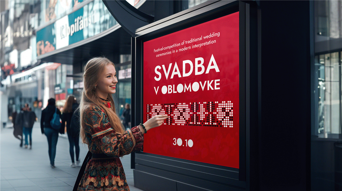
Objective
To develop a corporate identity for the festival of wedding rituals, combining traditional culture and modernity.
SOLVING
In this project, primary folkloric depictions of wedding rituals were transformed in a modern style and complemented by the grotesque typeface of the Jost family.
The synthesis of tradition and modernity demonstrated the unique beauty and poetry of the wedding tradition
Colors
The choice of red as the primary color is due to the fact that it has long been associated with beauty, light, warmth and fire in various cultures and traditions.

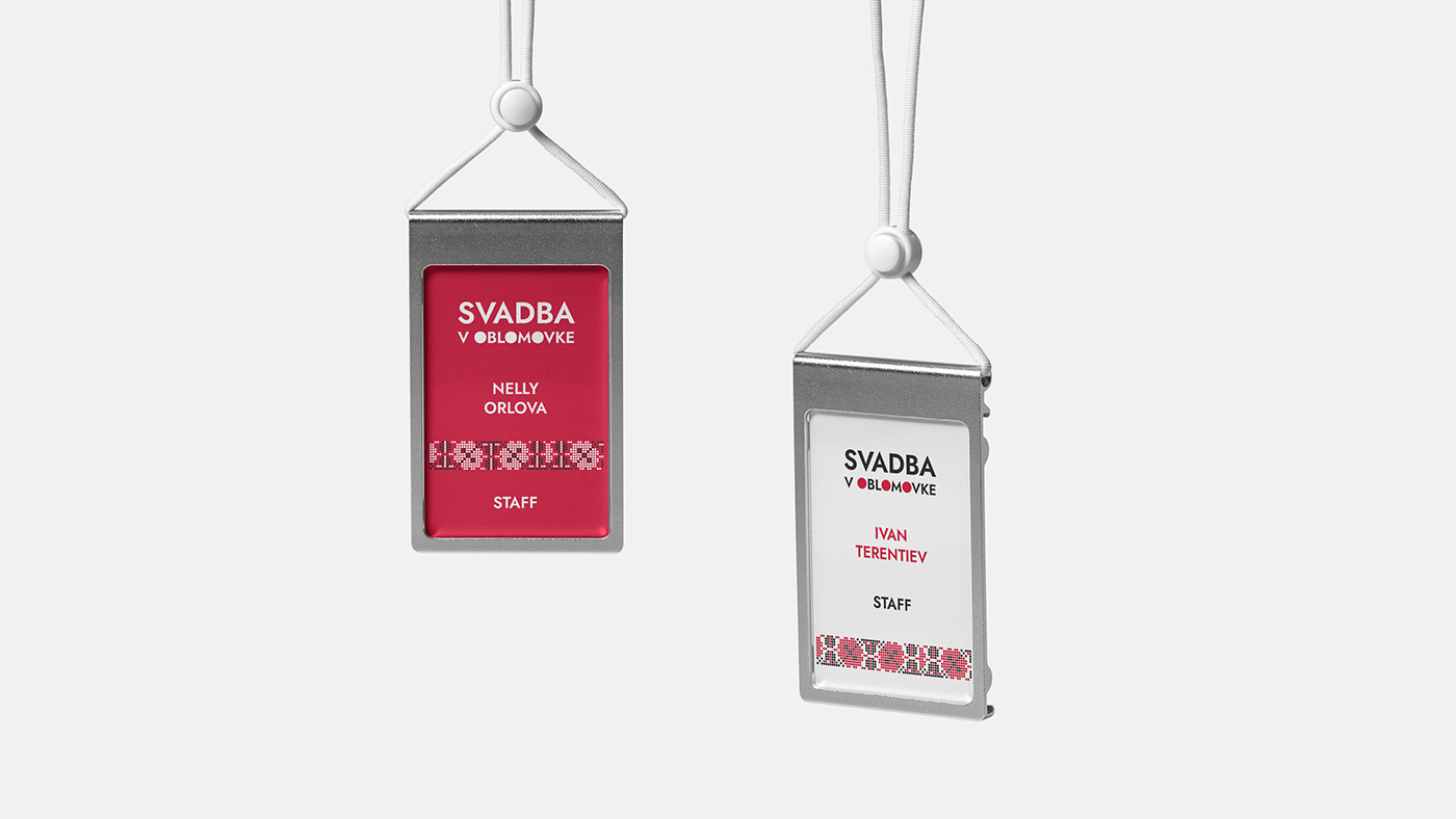
PATTERN
In addition, a great deal of inspiration from elements of wedding ceremonies and consultations with folklore experts led to the creation of a pattern inspired by the traditional wedding towel decorated with sacred symbols. This pattern serves as both wedding decoration and talisman.
In addition, a great deal of inspiration from elements of wedding ceremonies and consultations with folklore experts led to the creation of a pattern inspired by the traditional wedding towel decorated with sacred symbols. This pattern serves as both wedding decoration and talisman.
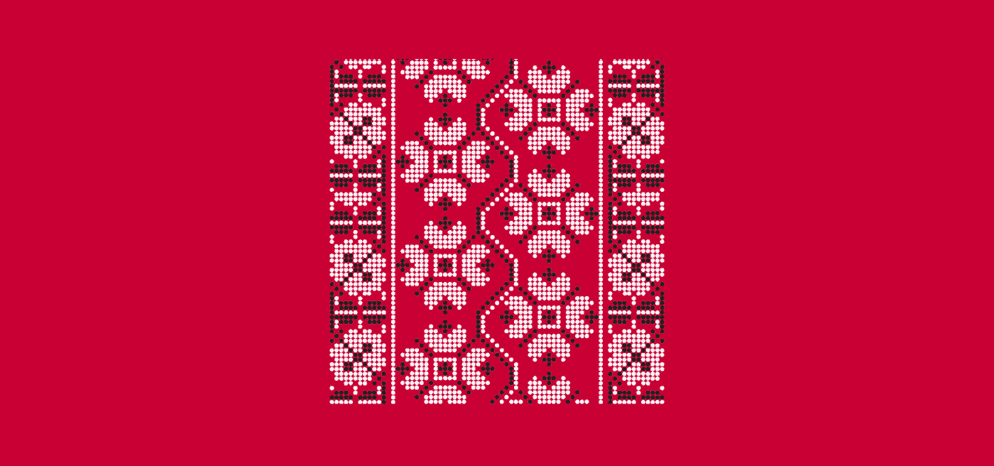


The image of two birds is a tribute to the tradition of releasing white doves from a cage during a wedding. In medieval Italy, this practice symbolized the purity and innocence of the bride.
All graphics in the project were based on traditional images of wedding rituals.


TYPOGRAPHY
Jost font family was chosen for the corporate identity of Svadba v Oblomovke festival. The playful character and modern image of the font does well in this project.


For the project we have prepared merchandise that can be used in everyday life. It uses illustrations with famous folk phrases about weddings. Here tradition meets the present.


